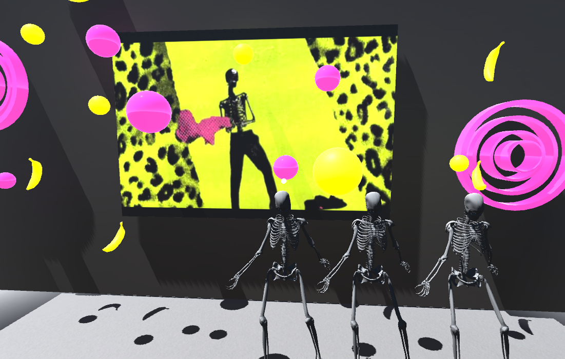
It's a dark, moonless night and a local company is having a Grand Opening of their mysterious gallery. The building has no windows but the sounds of music can be heard from inside. The company, Big White Box, specializes in the emerging field of Virtual Reality Music Technology. You are interested in both music and virtual reality. Intrigued, you make your way to the gallery for a Night At The Museum.
For this project, I wanted to create a company specializing in an emerging VR field. I chose the music industry after reading some articles about how VR is currently changing music on both a consumer and professional level. In particular, the music industry is incorporating VR to create unique ways to interact with music in 360 videos and sound. I called the company Big White Box because VR will fill an empty room with the visual and audio effects needed to create the desired environment. There is no need for props.
I had to cut out a lot of the video I had originally planned to use as I noticed the performance hit. I also did most of the videos as raw images in a UI canvas to reduce the performance cost.
Background
USER PROFILE
I based my user on someone who would enjoy music in a Virtual Reality setting. Lenny is a musician who also enjoys new technology.
Name: Lenny
Age: 25
Occupation: Musician
VR Experience: Enjoys VR games and Apps. Lenny is a talented musician. His ideal version of the world allows him to interact with things in a virtual world. In fact, he thinks spending time in Virtual Spaces might help him become more social because he can get used to being around virtual beings. Also, in his ideal world he could play before audiences without there being an audience. Like anyone else though, Lenny likes to experience new things and learn.
Sketches
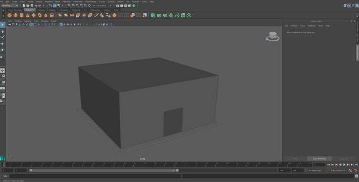
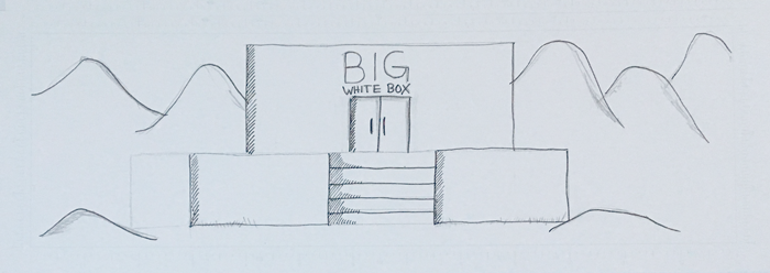
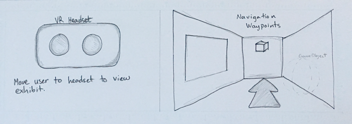
I started sketching and storyboarding before making my museum building in Maya, and a lot of the original concepts had to change. I originally envisioned two scenes, one in which the player was moved forward into a VR headset but the performance hit was too high.
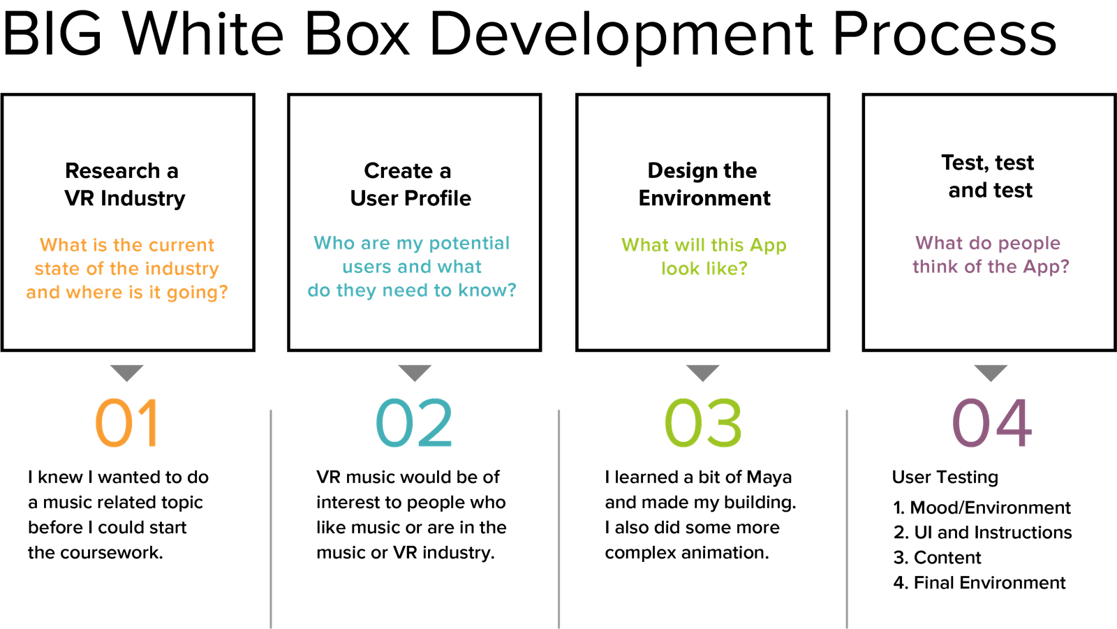
Process
User Testing
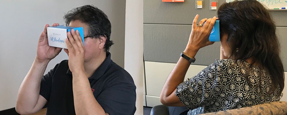
The user tests were done with one to two users per test type. Both users only previous VR experience was when they tested my Puzzler project. They were much more comfortable with using the navigation this time though this was their first use of waypoints. Mood and Environment
Mood and Environment
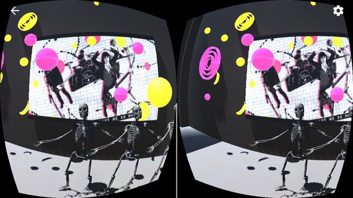
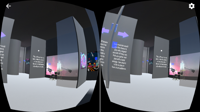
Question: What is the mood of the environment? (User 1) This is a big room, the mood is fun and about curiosity. (User 2) This is a big room I can see video and animation. I love the colors. Question: How is the sound level? (User 1) It's not too loud. (User 2) It fills the room, I can hear it everywhere. Question: What do you think of the animation? (User 1) The animation and video are good. I like that the skeletons have shadows. (User 2) The animations combined with the video give it a 3D feeling. Question: Is the navigation easy to see and use? (User 1) Yes, I can click through and see everything. (User 2) I wish there were fewer cubes. The color is a little hard to see. Sometimes I click on the wrong one because I can't tell which is which.
Changes to make:
1) Change 2D sound to 3D sound for realism
2) Use fewer Waypoints to make moving around faster
3) Change waypoint color from red to blue
User Interface and Instructions
Question: Are the buttons on the user interfaces easy to see? Yes, (clicks Pause and Play) and they work. Question: Go to the area in the left corner and try that User Interface? Okay, I see three buttons (clicks buttons). Question: What are your impressions? I don't like that when I click on the next button before the previous button's audio is finished that the next audio plays on top of it. It is confusing and I can't understand what is being said. Question: Do feel you are learning anything from the information, is it interesting? This is all new to me so yes no matter what I am learning something. It is interesting. Question: Now that all five exhibits are in place do you think they are different enough from each other? Yes, they are unique.
Changes to make:
1) Switch buttons to a play and pause so they do not play over each other
2) Consolidate the narration into one audio clip
Content
Question: What do you think of the information provided in the exhibits? (User 1) It is very informative. I liked the information about the headsets. (User 2) I learned some things and I didn't realize VR went back to the 90s. Question: Do the images and videos enhance or distract from the content? (User 1) Enhances it. (User 2) Enhances it. It is not just there for its own sake, it gets the message across Question: Do you feel you know more about the topic now? (User 1) Yes. (User 2) Yes, I do. Question: Did you have any difficulty using the panels? No, everything works smoothly (User 2) No, they work well.
Changes to make:
1) Add more content
Final Test
Changes made:
1) Only one video plays on start the rest are user activated
2) Audio is activated with a Play button and can be paused
3) Added extra waypoints for two exhibits
4) Added additional content
Question: How do you like the quieter environment? (User 1) It's better, all the noise isn't hitting you all at once. (User 2) Much better now, not so confusing. Question: As you move through the exhibits do any of them stand out to you? (User 1) The music app, I could watch that all day. (User 2) They were all good but I liked Bootsy (who doesn't). Question: Overall, what is your impression of the experience? (User 1) There was a lot to explore and it felt like I was in a big space even though I was just sitting in my chair. (User 2) I felt like I was in a museum which made me think that being able to visit a museum without really being there is intriguing.
Analysis
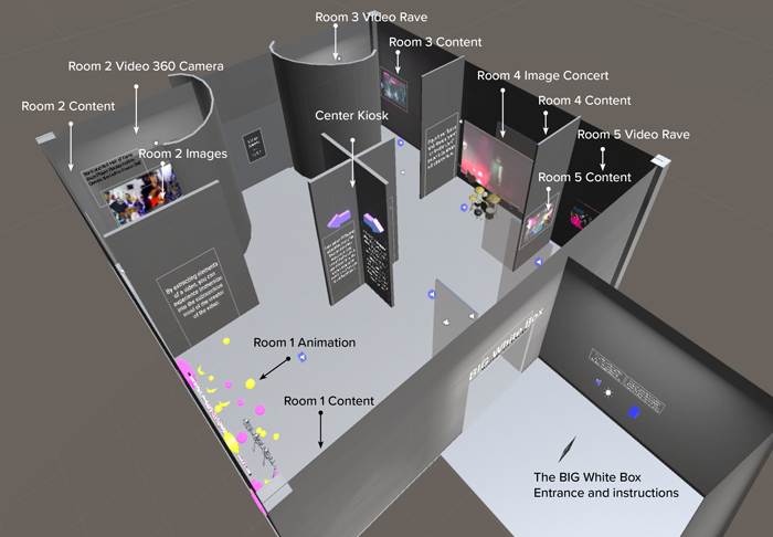
For this project I picked up a bit of Maya and made my own gallery building. The gallery is roughly divided into five areas or rooms to make the exhibits distinct. There is a lobby (the white box) which contains only instructions due to the premise of the company being that all you need is the box and VR creates the environment that fills it.
