Just seeing flowers makes us happy and there is actual science behind why they do. Though we are no longer at the mercy of the seasons, flowers signal the end of Winter and hunger, and yet the floral industry is in decline.
To try and understand why people were buying fewer flowers I started with the hypothesis that giving flowers had become inconvenient. I decided to focus on exploring flower and gift giving so people can prearrange the ordering, and so they do not forget to acknowledge and celebrate occasions.
Research & Analysis
Goals
Find out why people don’t purchase flowers or do so less often now, and discover what would make it easier for them.
Questions
[Behaviors] Why don’t people buy flowers and gifts?
[Needs] What is needed to make it easier to buy flowers and gifts?
Key Finding 1
The subjects would likely buy more flowers and gifts if they had a convenient way to order through an app.
Analysis
The app should make it convenient to order flowers and that convenience should be part of the app in all areas but especially in the ordering process.
Key Finding 2
The subjects want discounts and rewards for being frequent purchasers.
Analysis
The app should offer incentives and rewards to its regular users and give points and discounts.
Key Finding 3
All agreed that the major reason they did not buy flowers and gifts is that they forgot.
Analysis
The app should offer multiple ways to assure that occasions and events aren’t forgotten.
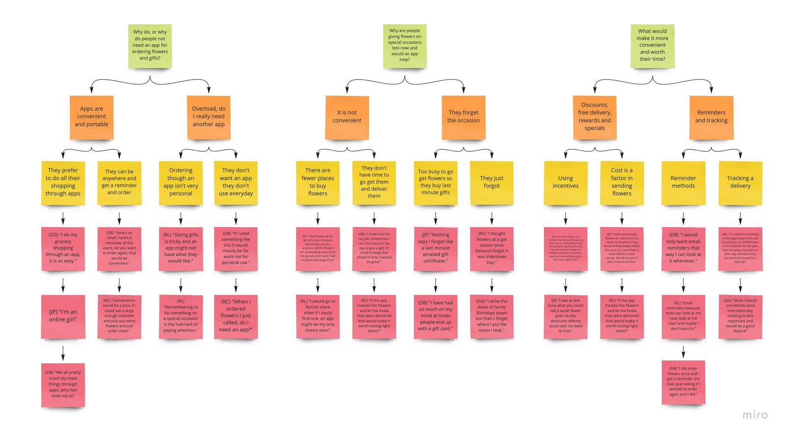
Data Mapping
Just seeing flowers makes us happy and there is actual science behind why they do. Though we are no longer at the mercy of the seasons, flowers signal the end of Winter and hunger, and yet the floral industry is in decline.
You can see details here Affinity Map
Concepts & Sketches
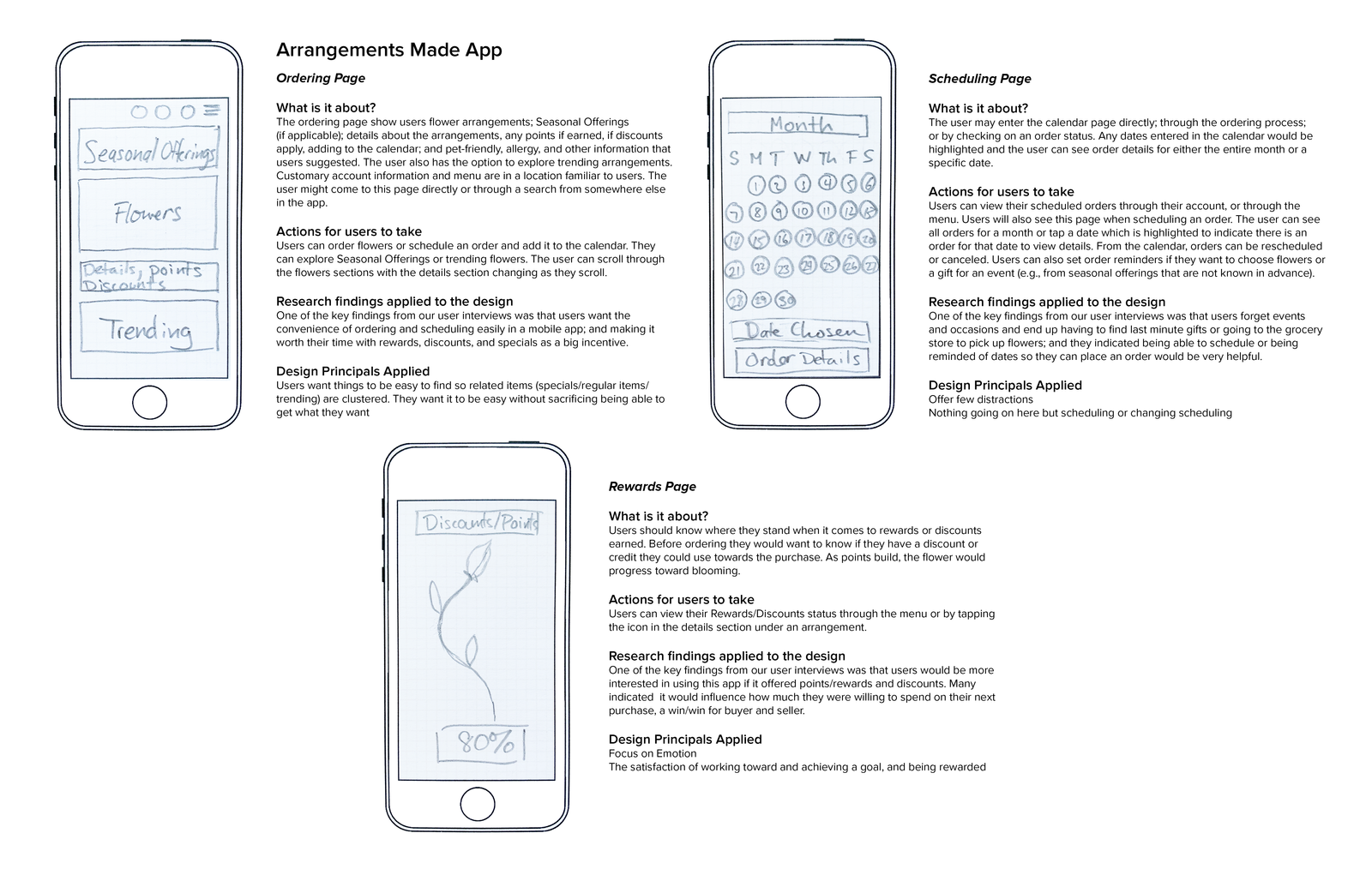
For my app concepts I applied Gestalt principles of design based on what my subject’s feedback was:• Convenience without sacrificing getting what they want
• Streamlined functionality, few distractions
• The satisfaction of achievement and reward
My sketches reflected those principles in their design.
Research Synthesis
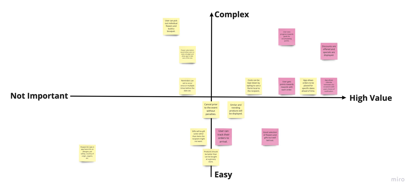
Once I had the features that users were looking for, I went through four stages of data synthesis:• Gathering the Themes and Opportunities
• Categorizing the Themes and Opportunities
• Choosing the features I would prototype
• Prioritizing those features
This was the crucial step leading to my first low fidelity prototype and user testing.
See all of the Details
Low Fidelity Prototyping
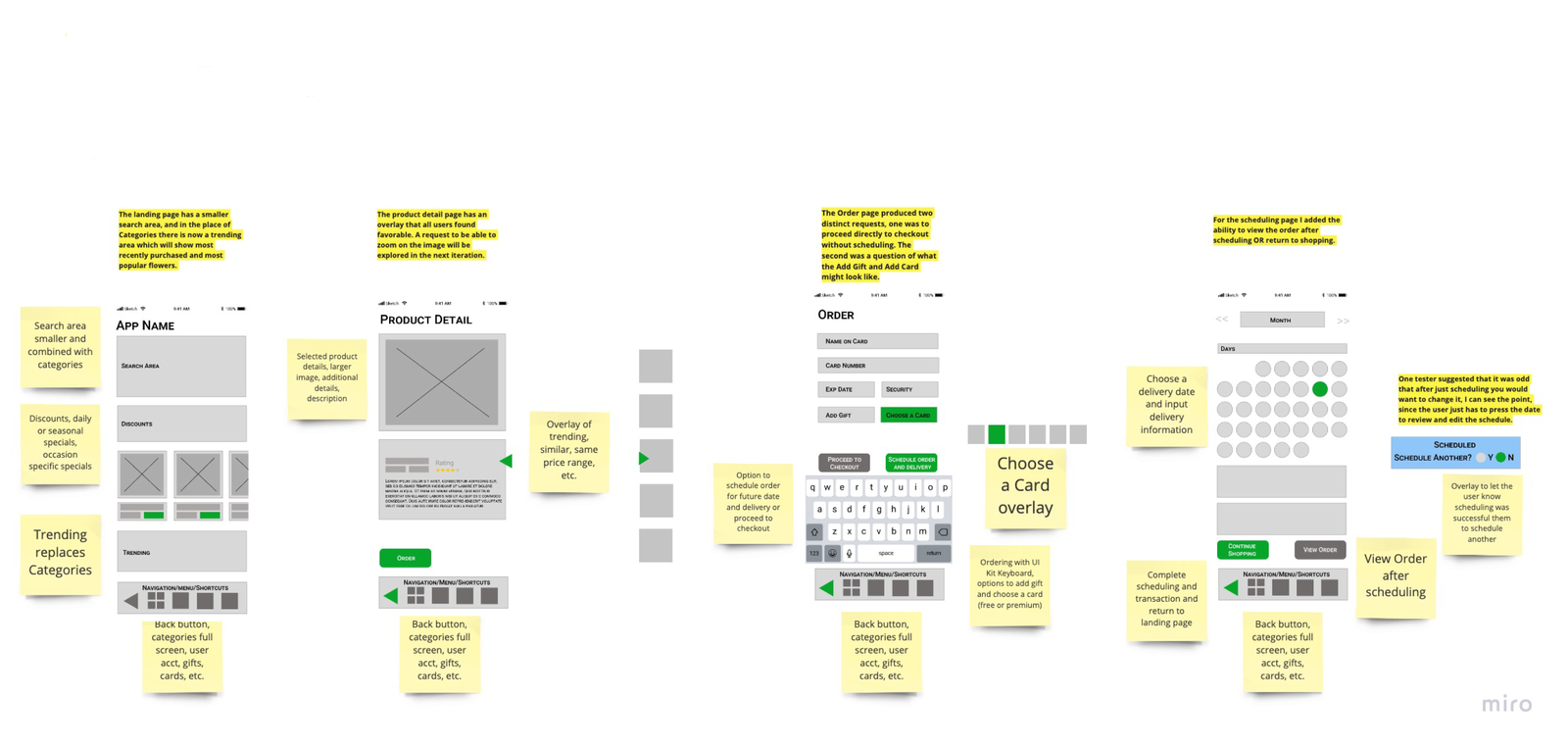
The prototyping was done in Figma. I did two rounds of testing on my prototype, the first was based only on the features that the test subjects said they would like, and the second iteration was based on the feedback given on the first low fidelity prototype. The features that I chose to highlight in my testing for this round were ordering and scheduling.Based on the user feedback I made changes to the features that did not pass and some of those that were neutral. After that, I asked the same testers to go through the prototype again to determine if I had interpreted their feedback correctly.
High Fidelity Prototyping
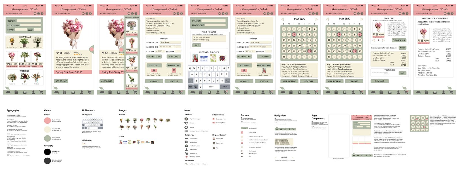
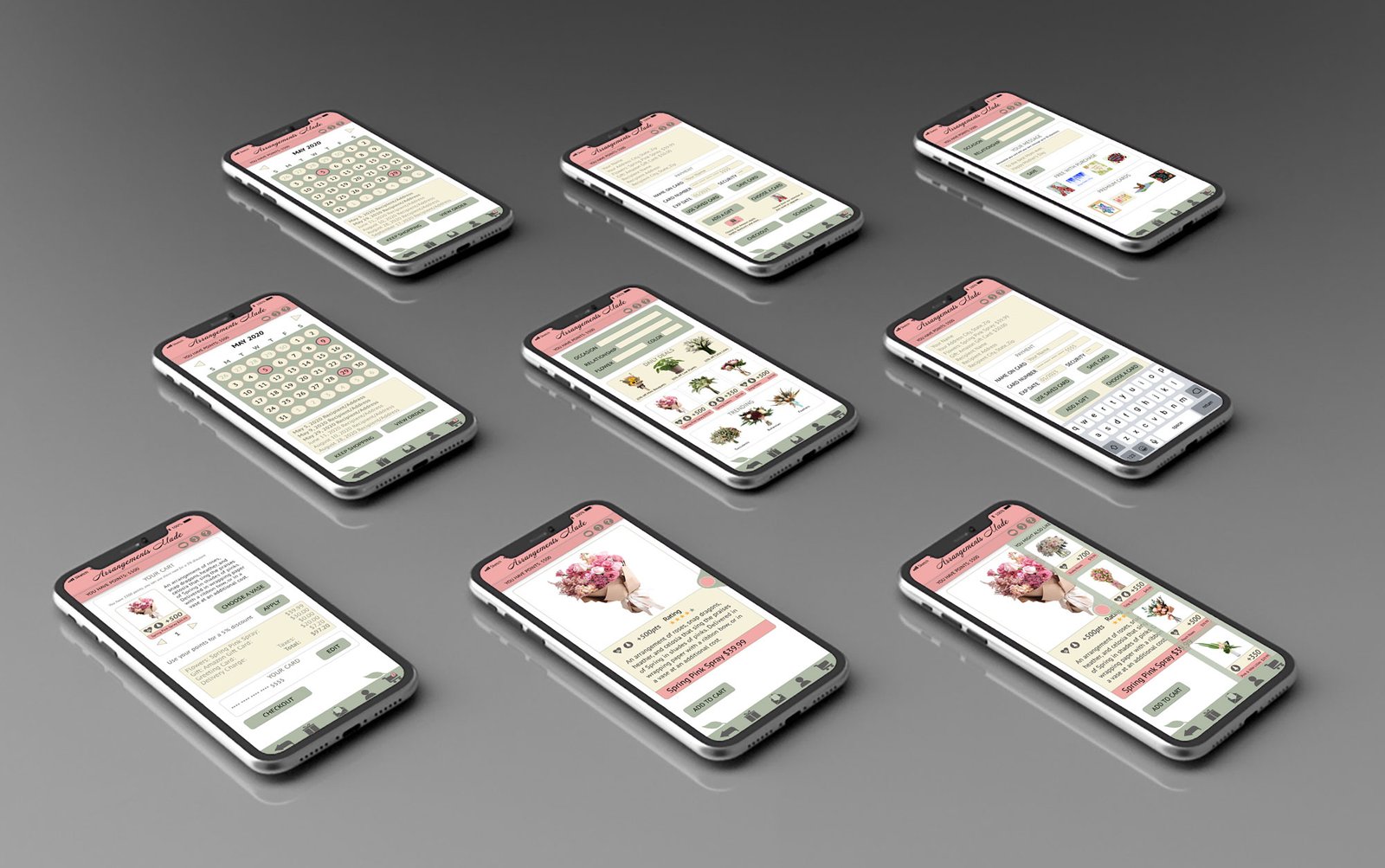
The next step is to gather assets; choose and pair typefaces; create a color palette; create icons; and decide which UIKit assets to use. Using Sketch and then uploading the screens to Figma, I recreated my low fidelity app flow. I used overlays to give the prototype a more realistic feel.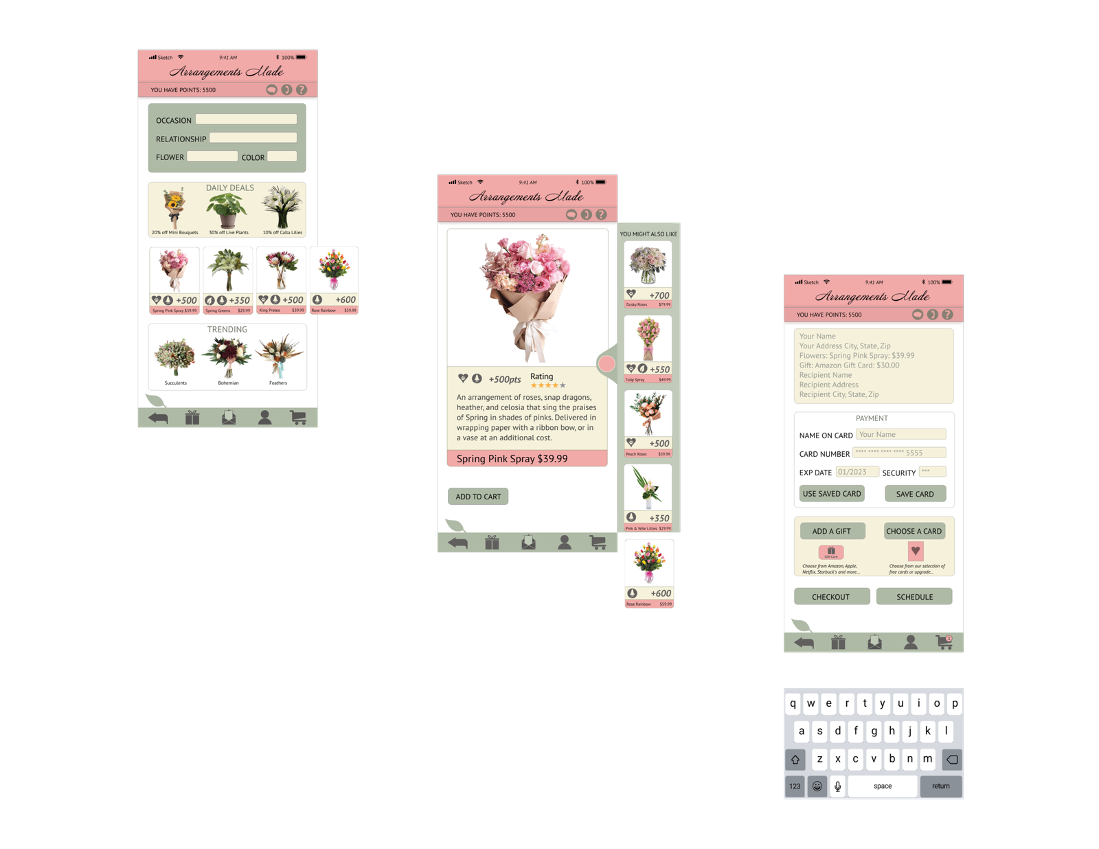
Style & Pattern Guides
It is easy to get caught up in the action phase of a project and forget to document your steps so that someone else can replicate them. Style and Pattern Guides are invaluable tools for handing off your project for a successful completion. It is also important to design systems so that you have a template you and others can refer back to.

Improving Accessibility & Performance
My initial tests of my app showed that it did not pass the contrast tests for type on some back ground colors. Some of the icons I had created also needed improvement. I darkened the type so it passed at all sizes and increased the background color of some of the icons.

Project Outcome
I keep that phrase on a note attached to my Mac at work, you are not your user. Until you ask users what they want and need you cannot defend the design choices you make. With that in mind, I approached this project by putting the user first and letting them drive usability portion of the design. The result in the end was an app they could get through end-to-end smoothly that was attractive as well.Link to Project
Link to Protoype
